A town with a brand, an app without one
Designing El Gouna's own community app. Access, bills, guests, and everything the town has to offer.
About the project
To invite a friend to El Gouna, you used to open a text box and type. Not their name into a field: their name, their email, their phone number, and their passport number, all of it, written out as one long message into a single freeform field. The same gesture as sending a text. That field lived in the old app, and it's the clearest snapshot of the problem I was brought in to help replace.
The town and the app it didn't have
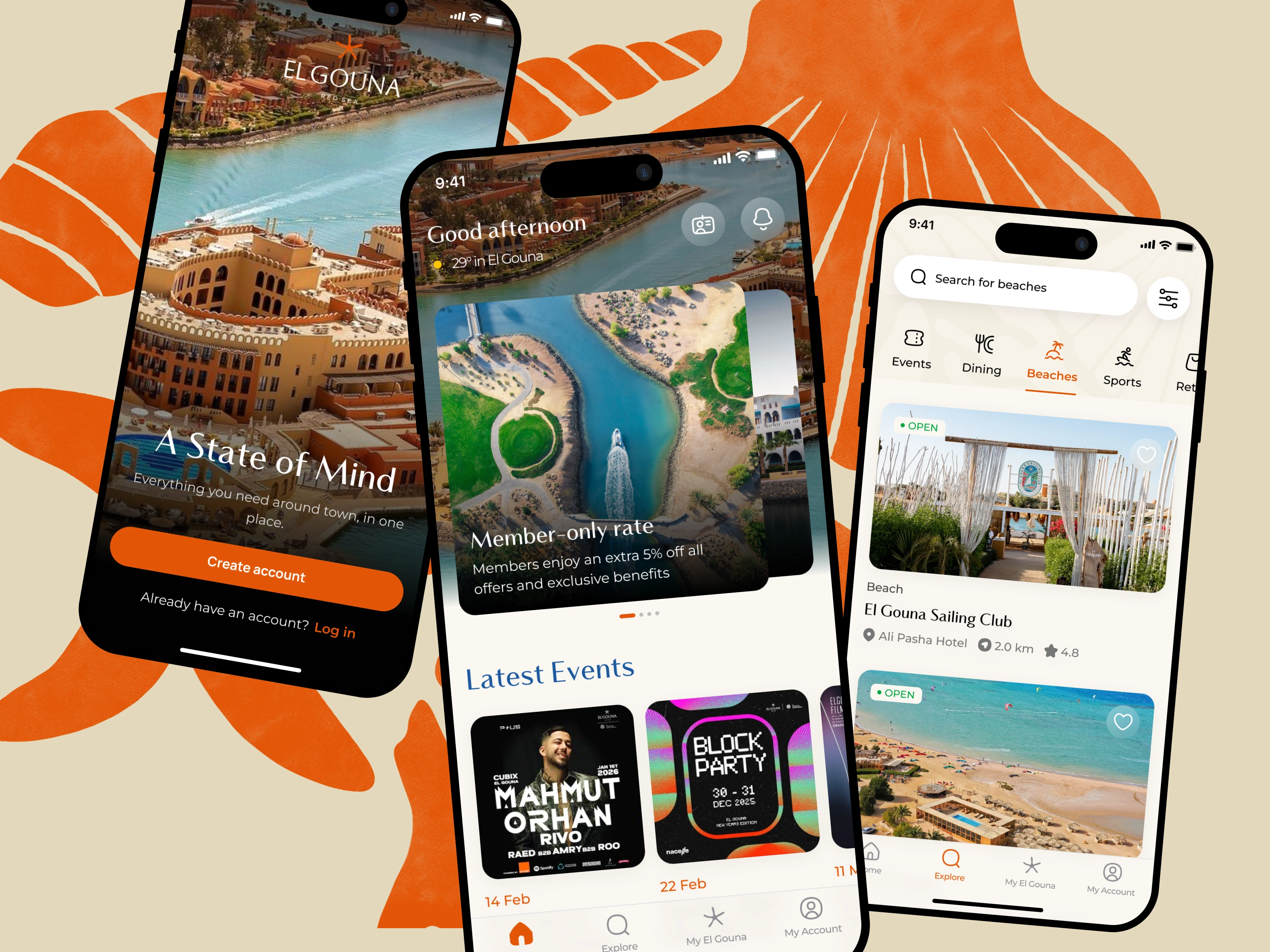
El Gouna is a gated resort town on Egypt's Red Sea coast: homes, hotels, its own marina, its own film festival. It has a strong, deliberate identity. Its app didn't. The community ran on a white-labeled product from a solution provider: functional for the essentials (access the gates, pay bills, invite guests, browse what's on) but generic, and missing the customizations the town actually wanted.
So they decided to build their own. They had a capable product team who'd already done the heavy lifting: a PRD, the information architecture, the core flows. What they needed before hiring a full-time designer was someone to turn that into a real interface and a design system the next designer could build on. That was me, for three months, as the UI designer.
I want to be straight about the scope, because it shapes the story. I didn't start this from zero. I started from half. The product was already scoped and structured by people who'd thought hard about it. Most of my work was execution on a solid plan. What makes it worth writing about is the handful of places where I pushed back on what I was handed, and each of those pushes resolved into something concrete.
Invites are permits, not plus-ones
The most interesting of those places was the guest invite flow.
At El Gouna, inviting someone isn't social. Most homeowners rent their places out as short-term stays, so the town caps how many people can be staying in a given window, and verifies every guest by ID. An invite is really a permit application wearing the clothes of a social feature, which is why the old app asked for passport numbers, and why it couldn't just let you add "+1." The single text field treated a regulated booking like a casual message.
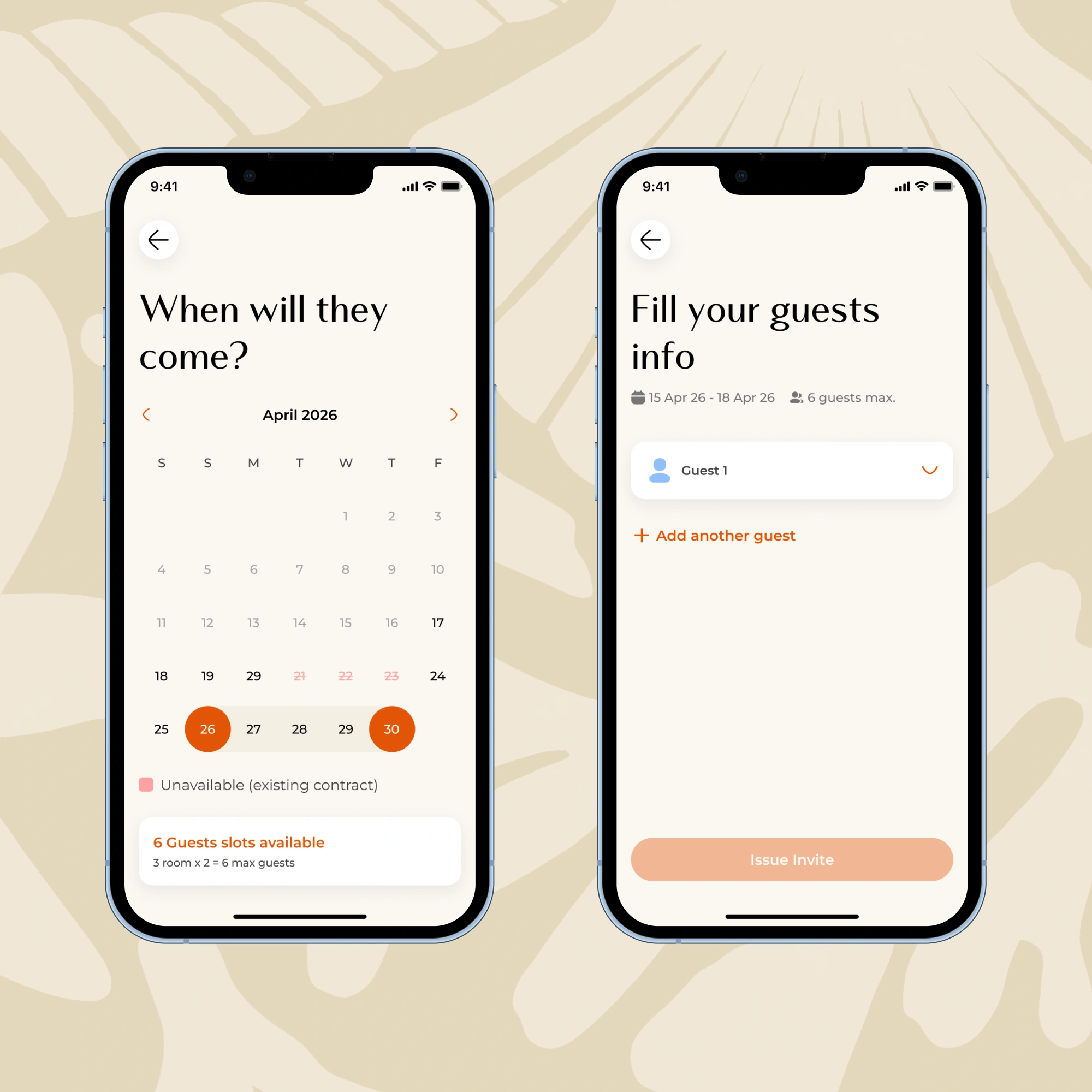
The new PRD fixed the freeform box, but proposed the invite as a single page: one screen, one step. On paper that's clean. In practice, once you lay out what each guest needs (name, email, phone, national ID or passport) and multiply it by several guests, then add the dates and the headcount, that one page becomes a wall of fields. So I argued to break it apart: progressive disclosure, one decision at a time, so it never reads as a long form even though it collects a lot.
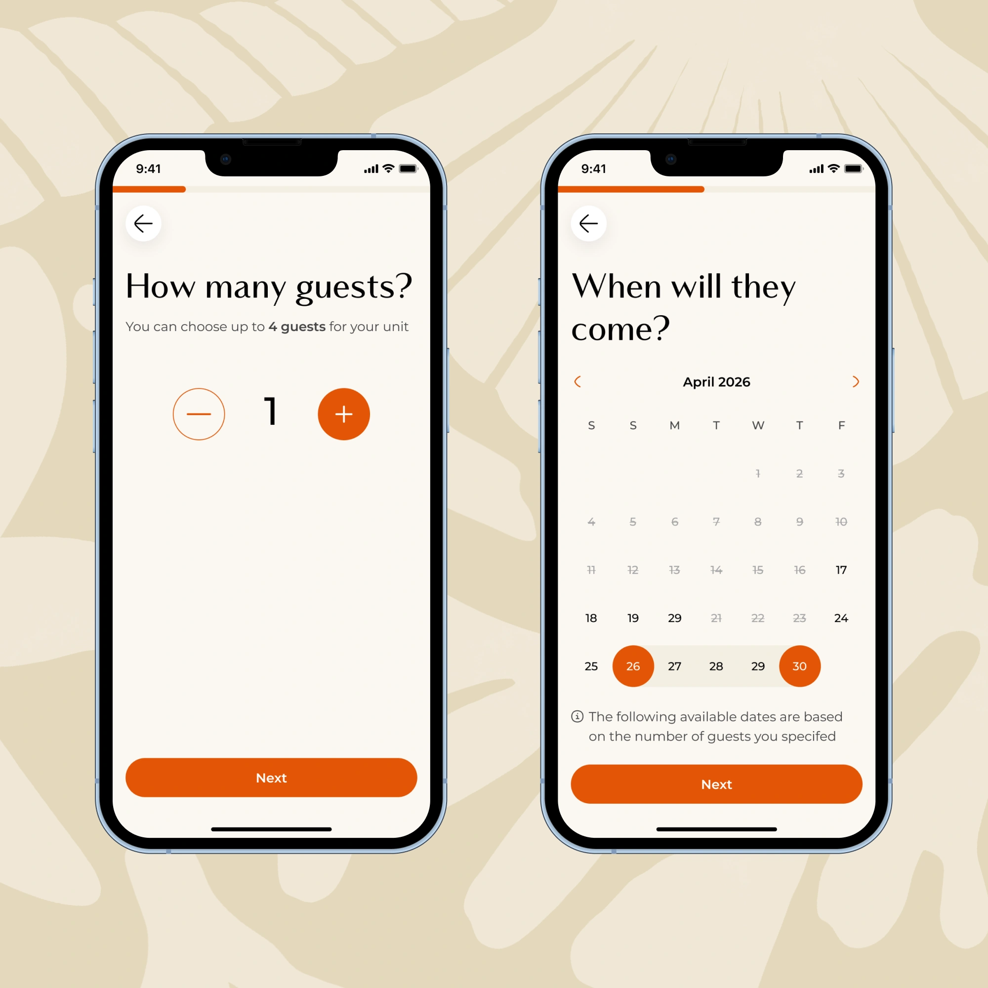
The PM pushed back at first: fewer screens is less to build, and a single page felt simpler. We met in the middle on splitting it up, but disagreed on what should come first. He wanted the dates first; it's the natural opening question: when are they coming? I wanted the number of guests first, because the count is what constrains which dates are even available. Five guests might be impossible in a week that already has invitations counting against the cap.
Rather than settle it on instinct, we ran a quick usability test. Guest count won, and why it won is the useful part. Date-first users would pick their dates, get into the flow, and only then discover the cap let them bring three of their group, not five. So they'd have to back out, change the dates, and start over, because they were never going to drop a guest. You can't tell one of three friends they can't come. But you'll happily move the trip by a week.
That gave me the principle the whole flow now hangs on: order the steps around what the user won't compromise on. Guests are fixed. Dates are flexible. Ask for the fixed thing first, and let the flexible thing absorb the constraint.
The flow ended up as: how many guests → which dates are available for that many (with the blocked ranges shown up front, not discovered late) → then the per-guest details.
One template per venue, and one for everything else
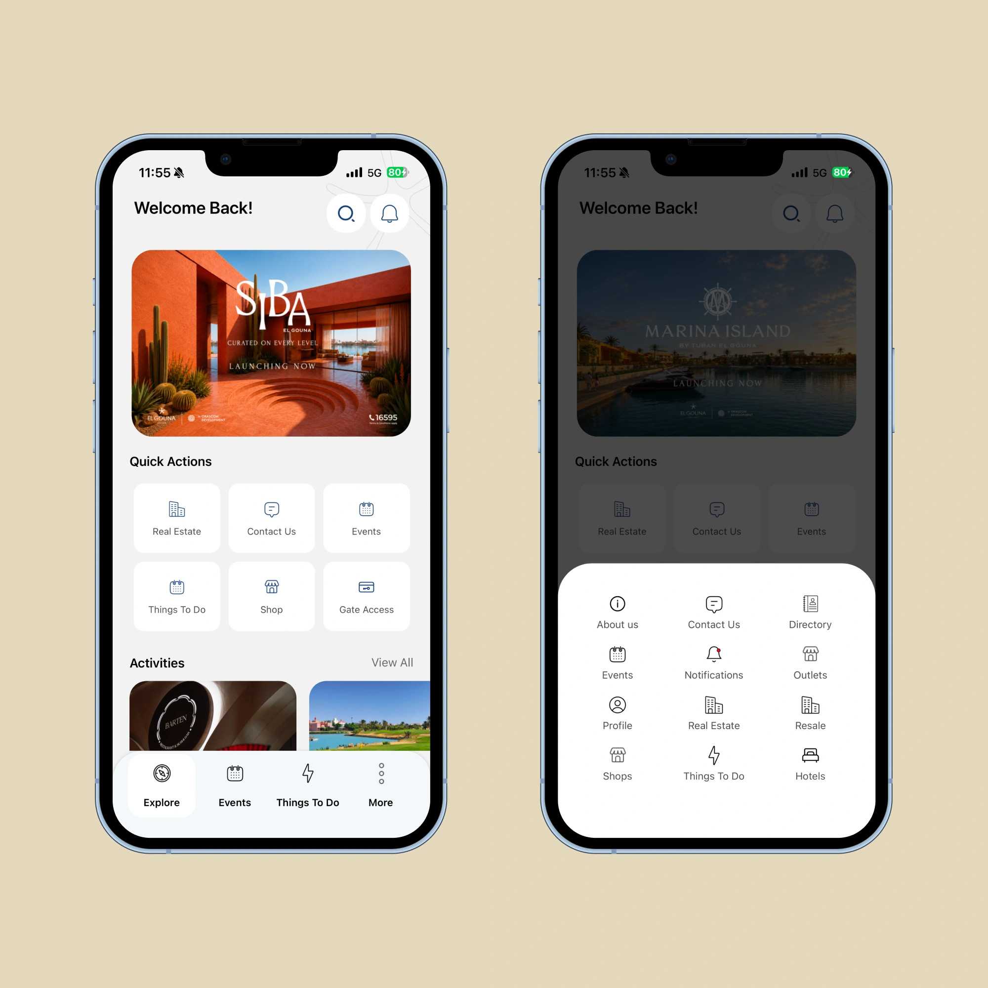
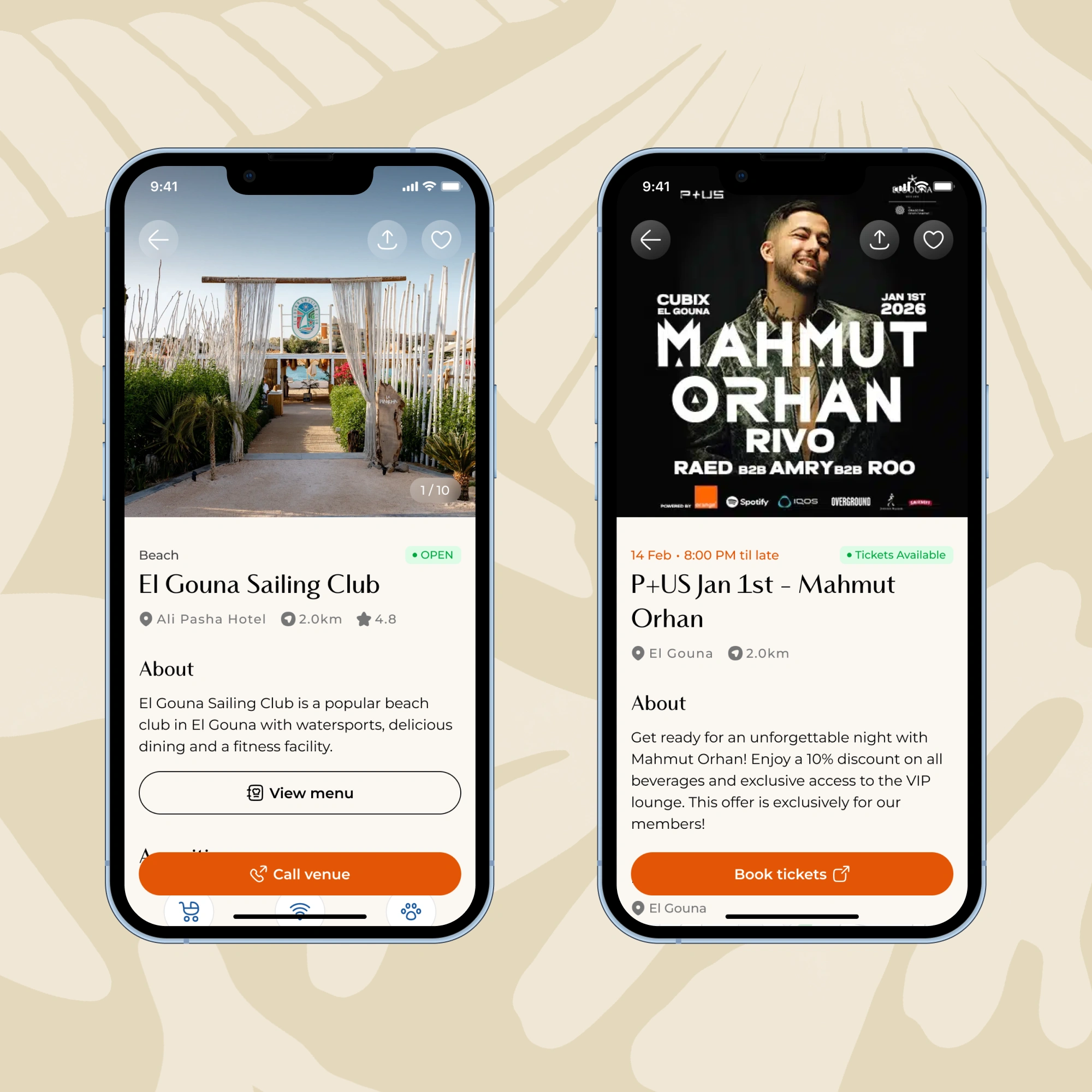
In the Explorer tab, I gave each venue type its own page rather than forcing them through one universal template, because the first thing you want differs by venue. A restaurant should lead with its menu and a way to reserve. A beach club leads differently. An event leads with its date and its tickets. The shared essentials (opening hours, location, imagery) sit underneath in a consistent block, so the pages feel like one family without pretending they're the same thing.
Six templates in total: restaurant, beach club, event, sport venue (the padel courts), retail, and a deliberately generic one for the long tail: laundry, services, the things that don't earn a bespoke layout. That last one was its own small call: not everything deserves a custom page, and giving each minor service its own would just bloat the system for no one's benefit.
A bill you could read at a glance
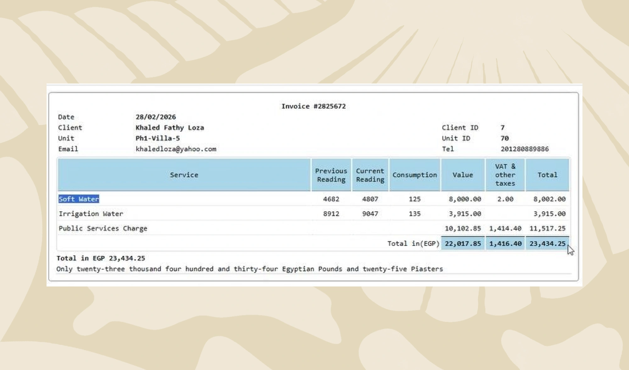
Water bills were generated as PDFs: one dense grid of meter readings, consumption, per-service values, and taxes, built to be printed. Accurate, but you had to read all of it to find the one number that matters, which is what you owe.
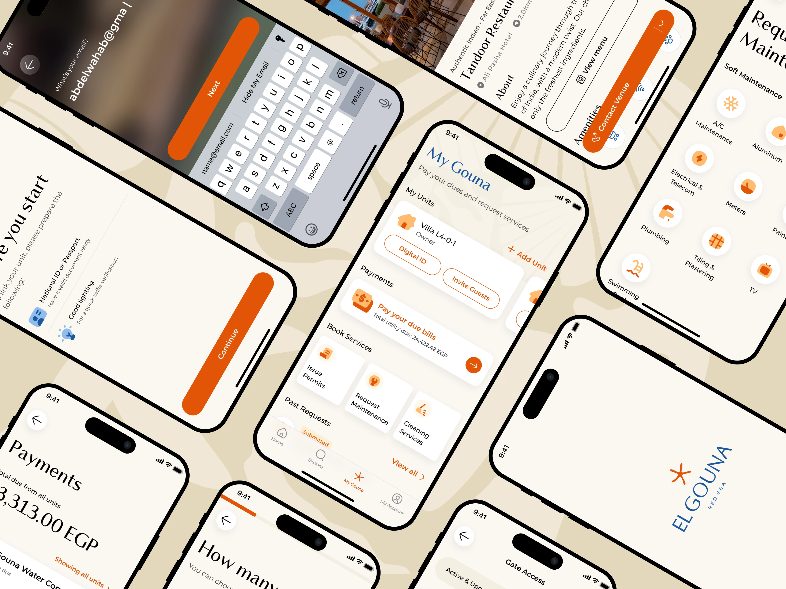
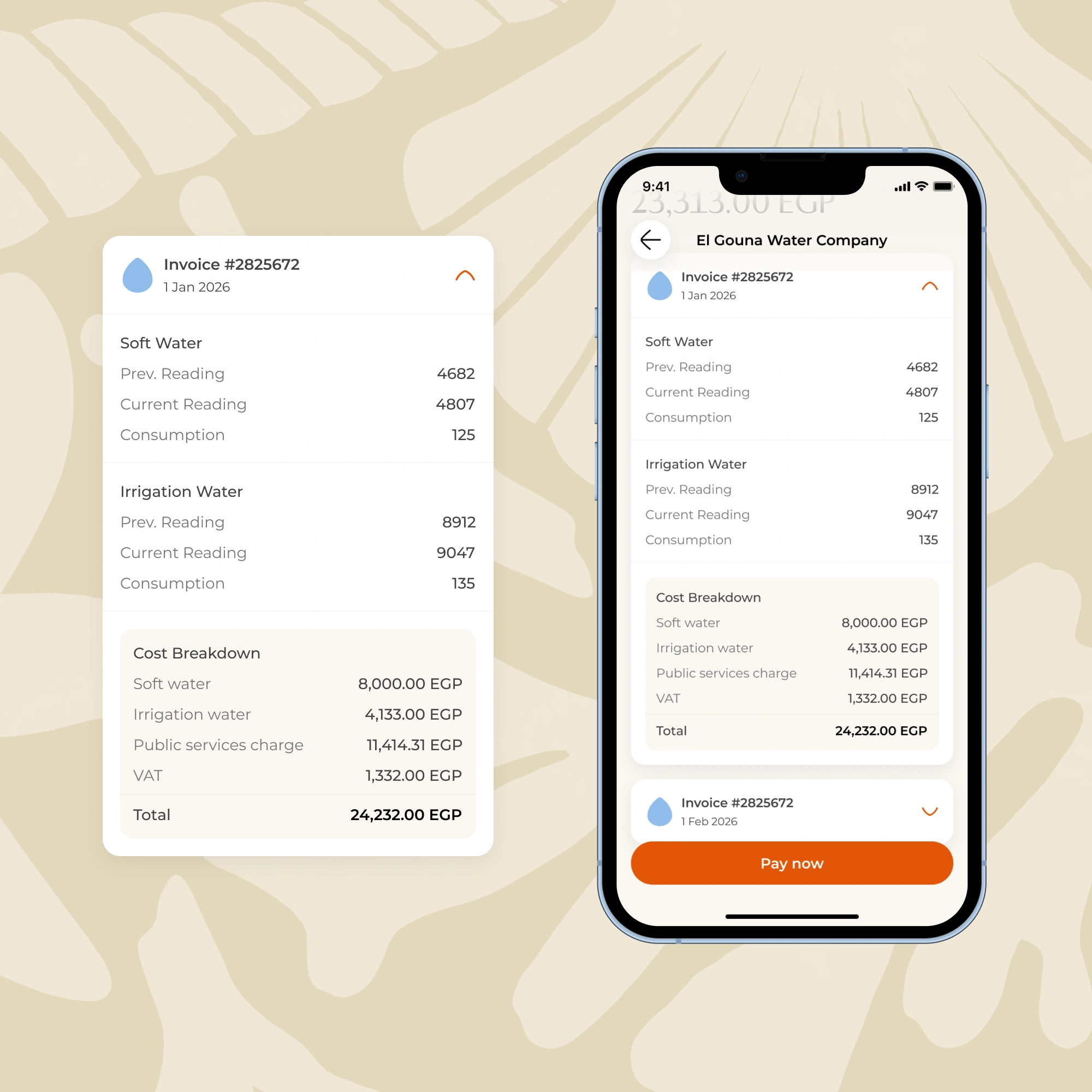
I split it into the two things residents think about separately: what they used, and what they pay. Meter readings collapse into a card you expand only if you want it. The cost breakdown and total sit one tap away. And unlike a PDF, you pay right there.
Designing the system for someone I'd never meet
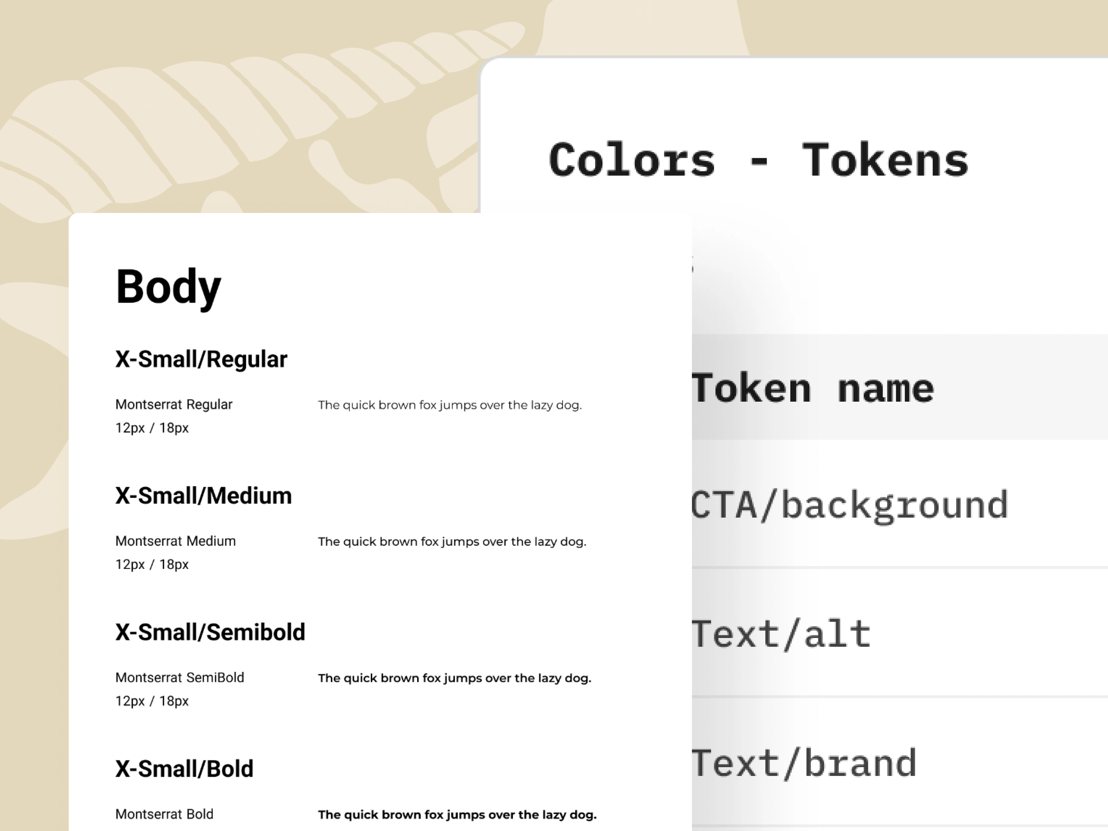
The design system itself was, in scope, fairly standard: type scale, color, components, all built on El Gouna's new branding, which was strong and a pleasure to build on. What made it worth thinking about wasn't the system. It was who it was for.
I was never going to live in this file. El Gouna planned to hire a full-time designer after me, someone I'd never meet, whose seniority and working habits I couldn't predict. The real user of this deliverable wasn't the app. It was that person. And that quietly changed what the deliverable was.
A spec is something the next designer can read straight off Figma: the scale, the spacing, the variants, all visible. What they can't read is why. The rationale isn't in the file unless you put it there. So I annotated the reasoning behind the choices, not just the values: why this scale and not a denser one, why a component is built the way it is, what's safe to change and what's load-bearing. The dev handoff and the design handoff became the same artifact, the same annotations serving two audiences.
The point of writing those down was simple: the next designer can't turn to me and ask what I meant. So everything had to carry its own explanation.
Where it stands
The app began rolling out this month. It's early, too early for numbers, and I'd rather say that plainly than dress up a launch as a result.
What I'd take from the project is smaller and more durable than a metric anyway: brought in to execute someone else's plan, the value wasn't in redoing it: it was in finding the two or three places where the plan was wrong and resolving each one against something real. A usability test instead of a louder argument. A constraint instead of a preference. A reader who isn't in the room.